Andy Gotts
Gotts is a photographer based in London and New York and most famous for his black and white portraits of Hollywood actors and singers. His work has been published internationally and has appeared in many magazines. He created a project called “Behind the mask” where he took pictures of famous people pulling “ridiculous” faces. A way for society to see the face of celebrities in a different way then the perfect world of makeup sophistication and glamour.
“BAFTA and Andy Gotts MBE to Exhibit ‘Behind The Mask’ Photography

Biggest collection of BAFTA-winning actor portraiture ever assembled to take over entire west wing of Somerset House. Exhibition images to be projected onto BAFTA HQ over weekend of Film Awards.
London, 11 December 2013: The British Academy of Film and Television Arts (BAFTA) has today announced that its new photography exhibition, entitled ’Behind the Mask’, will exhibit at Somerset House, London from 20 January to 7 February 2014. Some of the exhibit will then move to BAFTA 195 Piccadilly from 9 February up until 16 February, the date of the EE British Academy Film Awards, as well as Asprey London, venue of the Awards’ Official Nominees Party.
‘Behind the Mask’ is a BAFTA Future Archive collaboration with renowned photographer Andy Gotts MBE, a celebrity photographer for 23 years specialising in actors’ portraits, who together have produced ‘Behind The Mask’, a photographic census of over one hundred international actors and actresses to have won or been nominated for a BAFTA since 1954.
The project has been over two years in the making and seen Gotts travelling across the globe in order to photograph subjects including Lauren Bacall, Jeff Bridges, Daniel Day-Lewis, Al Pacino, John Hurt, Sidney Poitier and Tilda Swinton.”
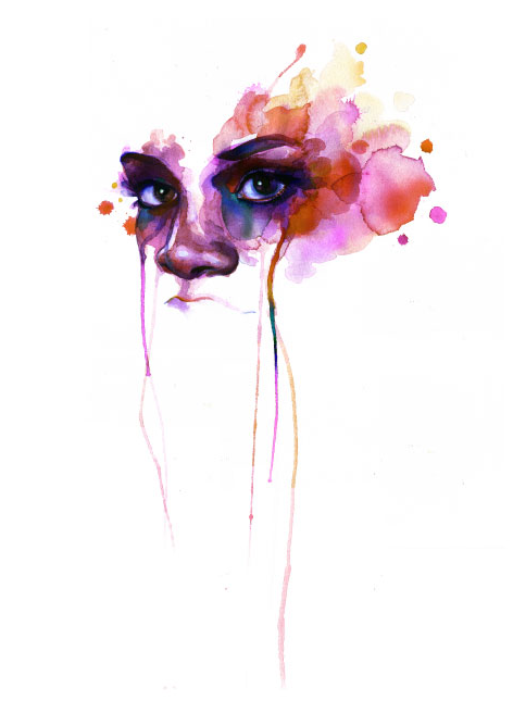
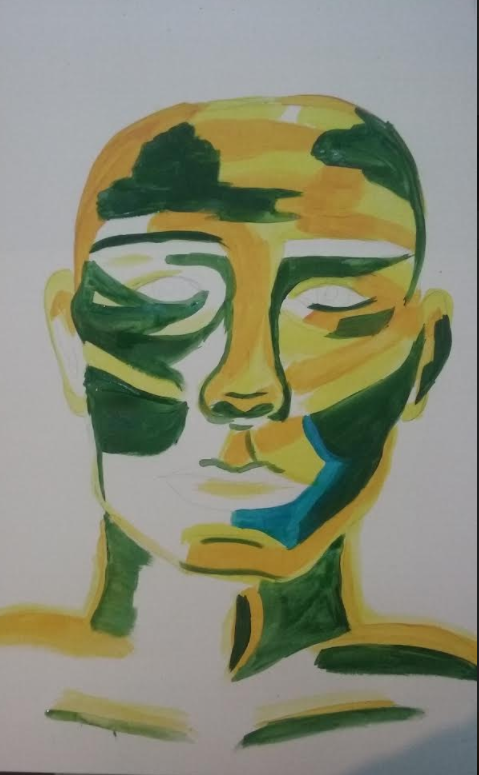
Davide Cambria
Self-taught painter based in Messina, Italy. Using rich colours to his portrait paintings gives a dramatic effect. His paintings are layered with abstraction and emotional depth. I think his pieces explores the concept of identity and deconstruction of the face. I think his work is exceptional and captures such emotion with in his artwork. In addition i think he matches the mood of the character of how he or she feels bey representing their mood in a colour and then adding it to and around their face. For example the picture below has a lot of added sea blue, the colour could represent sadness,boredom, jealousy etc.
Francoise Neilly
Francoise has her own technique to her stunningly vibrant and bold portrait art, by using a palette brush. Sketching with a palette knife then layering her painting careful enough not to mix to many colours together and layers each painting with thick paint.”Nielly says she picked the palette knife because she is not a patient person, but this misses some truth. She may paint quickly, but she works consistently and steadily, reshaping the field of portraiture.” During her masterpieces she only glances at her photos she has chosen for her large scale paintings.

Reading: Q&A WITH KNIFE PAINTER FRANCOISE NIELLY, part of the interview is below which i think highlighted what i want to capture within my final piece (highlighted in bold). I particularly find this artist inspiring due to the vibrancy of colour and yet still able to capture facial expressions and identity through the artwork.
“You are known for your colorful portraiture. What fascinates you about the human face?
ot of things fascinate me. But I’m much more fascinated with human faces because I’m meeting the models, seeing their faces and personalities. It is a reflection of the origin source—what can be sent as an energetic potential and what emanates from this person to me?
Are some of the models in your paintings people you know?
Most of the models are people I know.”

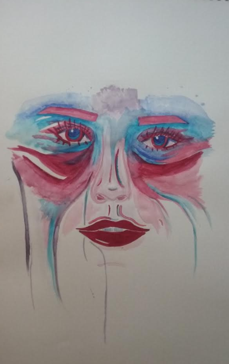
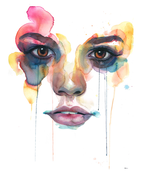
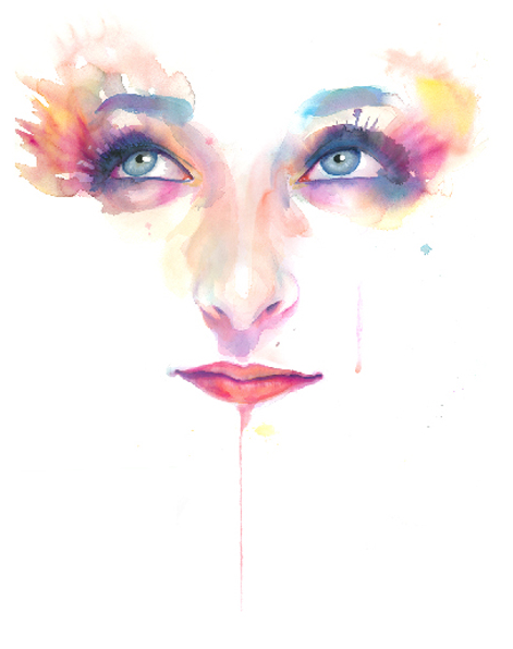
Marion Bolognesi
Based in New York her work has toured the globe with her beautiful delicate hand painted watercolour artworks. Always been interested in drawing, painting & fashion she found her inspiration for her art work. Marion illustrative watercolours paintings remind me of butterfly’s the way she highlights and contrasts the eyes. By including the main facial features of eyebrows, eyes, nose, and mouth shows enough to display individuality and that persons emotion. In a lot of her work i have noticed the colours she has used represent colours from summer for example: yellow for the sun and the bees, blue for the sky and the sea, pink to represent blossom and fruit. I think this also represents the butterfly idea which is focused around the eyes. A butterfly could represent opening up to show how a person is truly feeling. It could also represent curiosity and adventure by going out of your comfort zone.
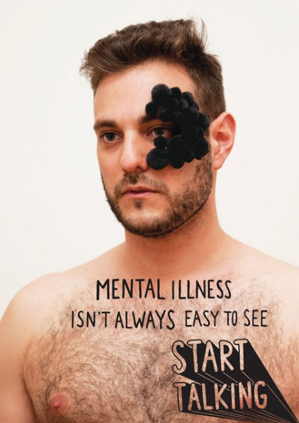
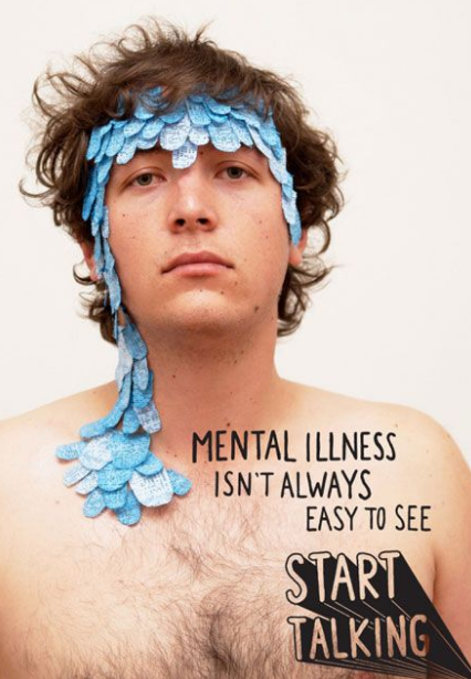
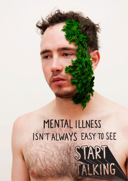
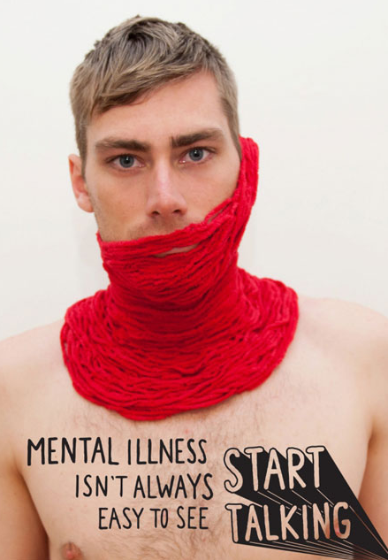
Start Talking campaign
Ian Laidlow
“One in five Australian men will experience a mental illness in 2012, with the prevalence higher among young people. Yet the problem is unspoken and swept under the rug. Not until we start talking about mental illness will individual expression, social norms and public policy change to address this health issue. This poster concept represents a physical manifestation of mental illness that cannot always be seen and is therefore not discussed. The first step is to start talking.”
Unfortunately during a few hours of research i was not able to find out more about the artist. However i really liked the artwork and found it inspiring because it was so different. I like the concept how the message is so clear with the use of creative thinking for the image.
Putting an unusual medium on to the victim such as black pompoms, pieces of flannel to show a pattern, moss, or wool too represent a virus/ mental illness makes it eye catching with out the need of gory makeup or realistic wounds to show their is something wrong with the model. The medium they have used automatically gets the audience involved and wants to know what the poster is for.
Trying to represent the mental illness with black pompoms shows one of the many ways the artist thinks the mental illness could look like if it was visible. I will take this into account and when being creative with my final piece and put more of my creative input in rather then development of emulations from artists.
Emulations:
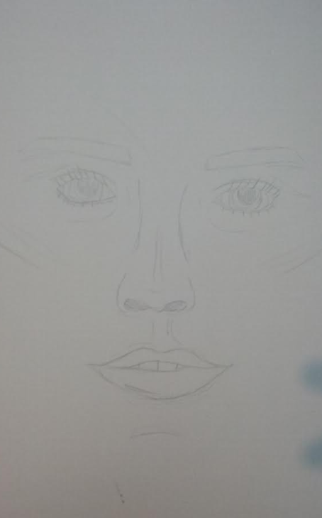
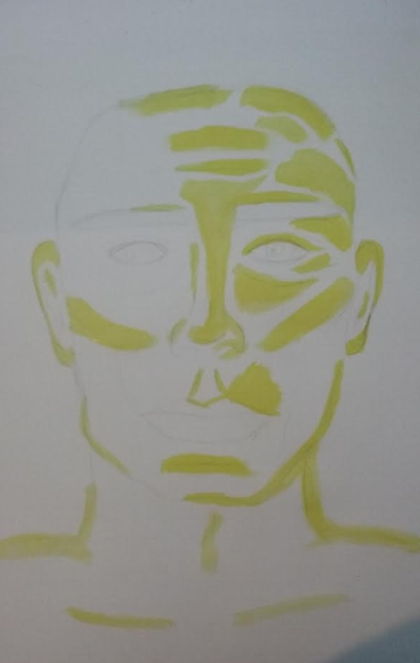
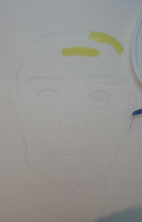
I found the artists of Francoise Neilly stunningly vibrant and bold portrait art inspiring and wanted to emulate her work. However i wanted to do it in more of a basic style and use more primary colours so i could focus of he highlights and features. I have also included the build up of the face below:
Next to improve the piece i would focus ton the highlight, shadow, contrast and ratio of the face so i have a better understanding of light direction.

I chose to emulate Marion Bolognesi work because her beautiful delicate hand painted watercolour artworks are particularly inspiring. Through my research i found Marion illustrative watercolours paintings remind me of butterfly’s outline, the way she highlights and contrasts the eyes. With in my emulation unfortunately i was unable to have the right medium of paint however i persevered, and chose to emulate her work though a selection of colours and colours the features rather then outlining them with fine liners to make it bolder. Next time i would improve the piece by making my producing a more delicate looking image by using the correct medium and reducing the size of the facial features.